During my early days as a Professional Service consultant, I used to travel from one customer site to another, effectively living out of a suitcase. I was in my mid-20’s, and the lifestyle was fun and adventurous — it gave me the freedom to work without being tied to a 9–5 office gig. However, there was one thing that I couldn’t escape no matter how many miles I flew: an overbearingly strict boss.
My manager was your typical Type-A from New York City with a razor-sharp tone and someone who had never used a pleasantry in his whole life. It was all business all the time, and he demanded the solutions I was building be top-notch. I have to thank him for teaching me an extremely valuable lesson — one that I’d carry throughout the rest of my career making my customers successful. A motto he repeated so many times it’s permanently inked onto my soul:
“Don’t ever make a dashboard unless it’s interactive!”
Interactive dashboards did for big data what iPhones did for cell phones; It allowed people to interact with technology in a way that’s intuitive and easy. Designing dashboards with user experience in mind is the difference between achieving useful analytics or having throwaway (expensive) solutions.
To the average performer, this idea will be met with resistance. They think these features require extra steps, additional work, and increase complexity. Building better dashboards save time and money in the long run. I argue that going the extra mile to make dashboards interactive and well-designed boosts their impact, increases value from the solution and makes organizations more successful by enabling them to make better data-driven decisions.
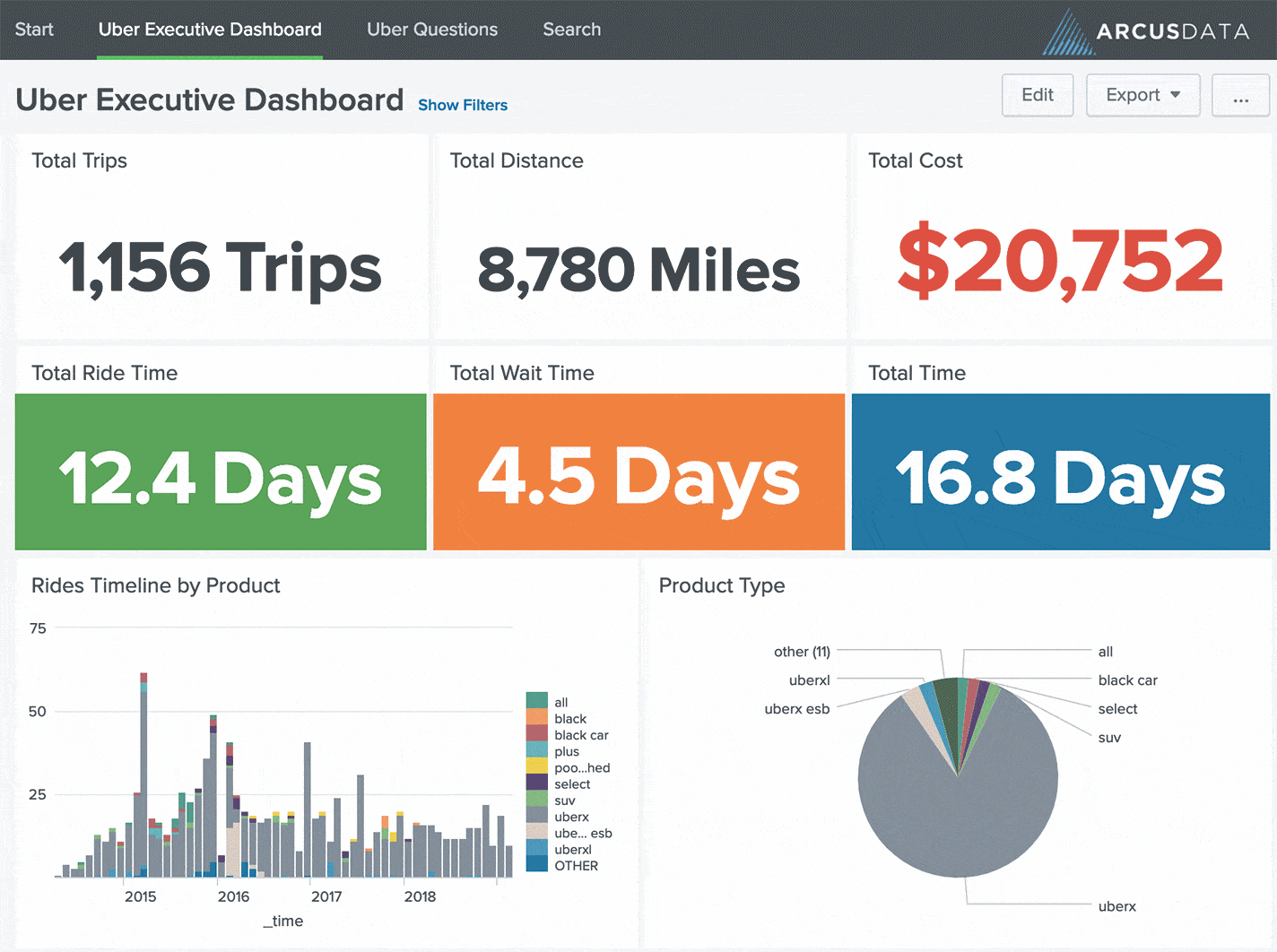
In a previous blog post, I shared my idea to build an Uber Splunk App as a teaching tool. Specifically, we talked about asking the right questions, visualizing dashboards first, then collecting data that helps tell a story. In this post, we’re going to focus on key guidelines for building a polished product so your users can be superheroes and go home early.
Lesson 1: Interactive or Bust
We live in a world of smartphones, voice controls, and touch screens. Interfacing with technology has never been more accessible. Your data isn’t static, so neither should your dashboards. One tip that I use for building dashboards is starting with the Splunk Dashboard Examples app. As you scroll through the examples and pay particular attention to “Forms Input.” Allow users to type in keywords, use dropdown menus, checkboxes, and time ranges to quickly slice-and-dice the data. Don’t assume you know what your users want. Schedule time to demo dashboards with your customers, let them drive and solicit live feedback. Incorporate their ideas into the finished product.
Lesson 2: Important Stuff First
Have you ever picked up a newspaper and only skimmed the headlines? Centered up at the top is the featured story that draws the most attention. In Western culture, we’re conditioned to read top to bottom, left to right. The same principals are true when developing dashboards. Try using bigger fonts to call out important facts and figures. Position charts or numbers that are most impactful first, followed by supplemental graphs or visualizations second. Ask yourself, “If this dashboard were a newspaper, what information would I retain just by skimming?”
Lesson 3: Leverage Drilldowns
There’s a powerful little feature in Splunk that hardly gets any attention and usually goes unnoticed. I’m talking about drilldowns — or the ability to “dive deeper” into results. For example, you might want to share additional insights when users click on data points, table rows, or other visualization elements in a dashboard. Implementing drilldowns give analysts the ability to interact with observations, follow hunches and go down rabbit-holes without writing code. Practice empathy while building dashboards and put yourself in their shoes/mindset. Ask yourself, “What should happen if I click this result?”
Lesson 4: Write Instructions
This one is so simple to implement, yet it’s laughable how rarely done it is. You’d be shocked to learn just how few Splunk dashboards come with instructions. Don’t get lazy and fall into this trap! Take the time to type out useful directions for your users. What data are they looking at? Where does it come from? How do the controls work? Whom do I contact if I need help? Don’t assume the person using your dashboard has any clue what they’re looking at. It’s your job as a designer to help guide them on their journey. Investing a couple of minutes writing good instructions will save hours of support and frustrated customers.
Lesson 5: Keep it Simple
A big part of my job is coming in after-the-fact and cleaning up Splunk use cases and custom developed dashboards. I only half-jokingly tell my friends I’m a “big data janitor.” Don’t try to cram every last panel into one behemoth dashboard. Keep your environment tidy by separating panels into clearly defined categories.
Think about the dashboard with 17 panels that takes 2 hours to load. What panels are the most important? Which ones give the critical figures and help tell the story? By grouping key pieces of related data together you enable the user to decide which data she wants to see.
- Separate one giant dashboards into 2–3 bite-sized chunks
- Logically group related pieces of key information
- Use the navigation and dropdown menus to guide users
Want more insight like this? Make sure to follow us on LinkedIn, Twitter and Facebook!