
During the Holiday Season I was doing what a lot of professionals in my industry do. I was enjoying some well deserved time off, spending time with my family, and closing out one particular task that I despise more than anything: submitting expense reports.
While slogging through hundreds of e-mail receipts, cancelled rides, and surge pricing statements I started to think, “man, I sure do take a lot of Uber rides”. Then a brilliant idea struck me! I should make an Uber Splunk App.
What follows is a three-part series dedicated to showing you how the sausage is made. How to go from a tiny inkling of an idea to a full-fledged use case. Why you should leverage a powerful data visualization tool (like Splunk) for rapid prototyping. Instead of focusing on the technical nuts-and-bolts we’ll explore “big ideas” like design, approach, and how to incorporate user feedback.
Follow these guidelines and your next Splunk App will be more intuitive, tell a more impactful story, and increase the value from your big data solution.
Part One — What came first? The data or the dashboard?
The most obvious (and completely wrong) place to start is the data. I often hear engineers thinking along the lines of “give me the data and I’ll build you a dashboard”. This approach is fundamentally flawed. In fact, years of this approach have led to incredibly poor designed dashboards, non-intuitive interfaces, and mass frustration from end users. It’s no wonder that dashboards have evolved to look more and more like the data underneath. Instead, I argue the best approach is the start with the end in mind.
What questions are you trying to answer? Who is the audience? What story are you trying to tell?
Back to the Uber example. I knew I’d taken a lot of rides, but what exactly did I want to know? I sat down and brainstormed a long list of burning questions:
- How much money did I spend on Uber this year?
- How many miles did I ride in an Uber?
- What city do I use Uber the most?
- What was my most expensive ride?
- What time of day is most popular? Month?
- Am I using their ride share service more, or less?
- What’s the breakdown of Uber X vs XL vs Pool?
- …. and the list went on for over 30 questions…
Step 1 — Mockup a Dashboard
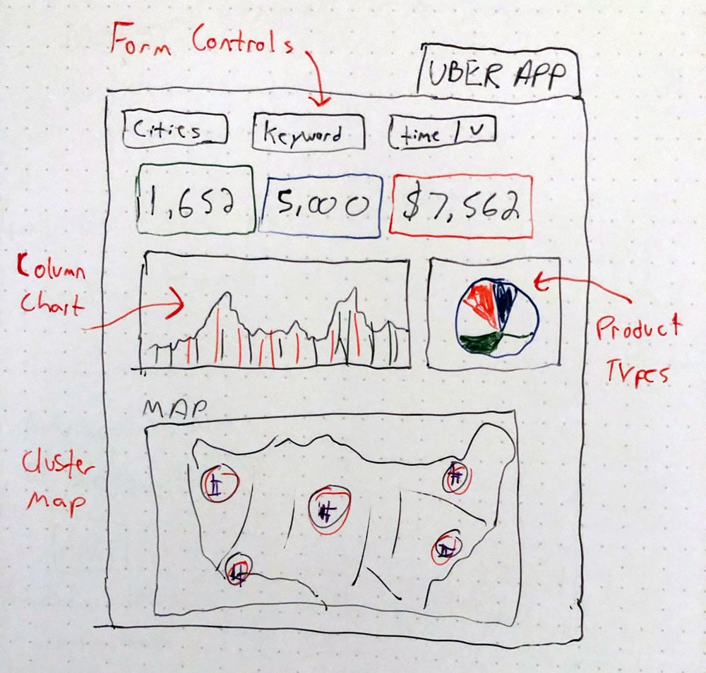
I’m a visual learner. If you’re anything like me your notebooks are filled with sketches, designs, and scribbled down notes. During the creative process I like to visualize and document the following:
- Who is the audience that will be using my dashboard? Skill level?
- What pieces of information are most useful? (Display at top)
- What device will be used? (Laptop? TV Display? Smartphone? Tablet?)
Step 2- Getting The Data In
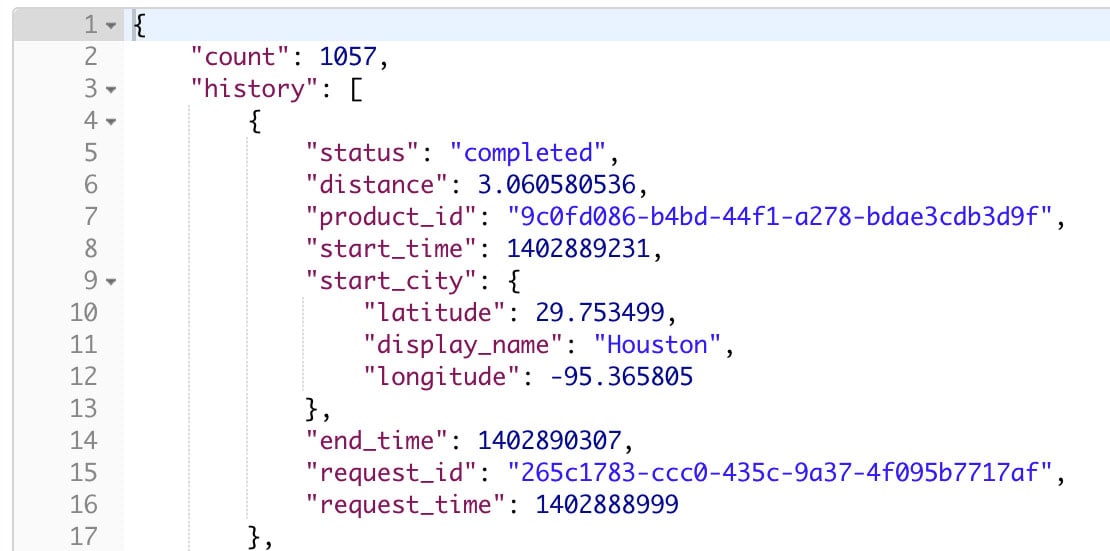
Now that we have well defined requirements in place, it’s time to work backwards to solve for X. I spent time digging into the problem and came up with three viable options:
- Mine / parse the e-mail receipts in my inbox
- Use the API key to collect the data
- Request a data download from Uber directly
The first option would have taken time to instrument but could be automated. The second method (API) is easy to implement but the information returned is very limited. As it turns out, Internet Privacy Laws force companies like Uber to hand over all personal data upon request. We have our winner!
Now that we have our questions written down, dashboard sketched up, and data available for analysis — it’s time to actually build the damn thing!
In the next blog post I’ll explore the ins-and-outs of building interactive dashboards, the pros and cons of data visualizations, and how to make your dashboard really stand out!
Thoughts? Feedback? Please comment below and let’s start a dialog.
Thanks for reading.
Want more insight like this? Make sure to follow us on LinkedIn, Twitter and Facebook!